

Grant Lee
CO-FOUNDER AND CEO @ GAMMA
Grant Lee is CEO and co-founder of Gamma, an AI design platform serving 70 million users with $100M in ARR.


CO-FOUNDER AND CEO @ GAMMA
Grant Lee is CEO and co-founder of Gamma, an AI design platform serving 70 million users with $100M in ARR.

Human progress runs on ideas, but ideas do not win on merit alone. Gamma's keynote at UNBOUND opened with a wager: think of the best idea you had this year — not the biggest, just the one where you thought there must be a better way — and admit that nobody shipped it the following morning or threw a party. The distance between the inside of one person's head and the inside of another's is, in the speaker's words, where a great deal of human potential goes to die.
What followed was not a product pitch but an argument about constraints: how the limits on ideas have moved from proximity, to access, to time; why artificial intelligence has not lifted the current constraint but intensified it; and why storytelling — increasingly visual storytelling — is the craft that decides whether an idea is understood, remembered and repeated. The talk closed with three practical principles, a bonus one, and an unambiguous claim: good communication leads to better decisions, and better decisions lead to better outcomes.
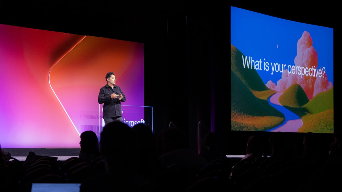
The session opened by asking the audience to recall their best unshipped idea of the year.
The keynote began with an exercise rather than a thesis. Every person in the room was asked to recall their best idea of the year — the small, obvious observation that something at work could be done better. The speaker then made a bet: no company in the room acted on it the next day, and nobody celebrated it. Not because the idea was weak, but because getting another human being to see what you see takes effort that most of us never budget for.
That is the premise the whole talk rests on. Ideas are not self-propelling. They do not travel on quality alone. In every organisation there is a quiet attrition rate of perfectly good thinking that never survives the journey from one mind to another, and the talk framed this loss as a structural problem worth solving rather than a personal failing.
The structure signposted from the start was deliberately simple: where the communication gap comes from, why it is getting worse right now, and what organisations can actually do about it

The constraints on ideas, the speaker argued, are not the same as they were five thousand years ago — or even five years ago. In the first era, the limit was proximity. Ideas moved only as far as a person could physically carry them, within small groups and through fragile oral transmission across generations. At civilisational scale, that meant tens of thousands of years of a mass experiment with enormous participation and no mechanism for sharing results: someone thousands of miles away simply re-solved the identical problem from scratch.
Writing broke that constraint. An idea could suddenly outlive the person who had it and travel across both space and time, detached from its originator. But writing introduced a new limit: access. Ideas were only as powerful as the number of people able to reach them.
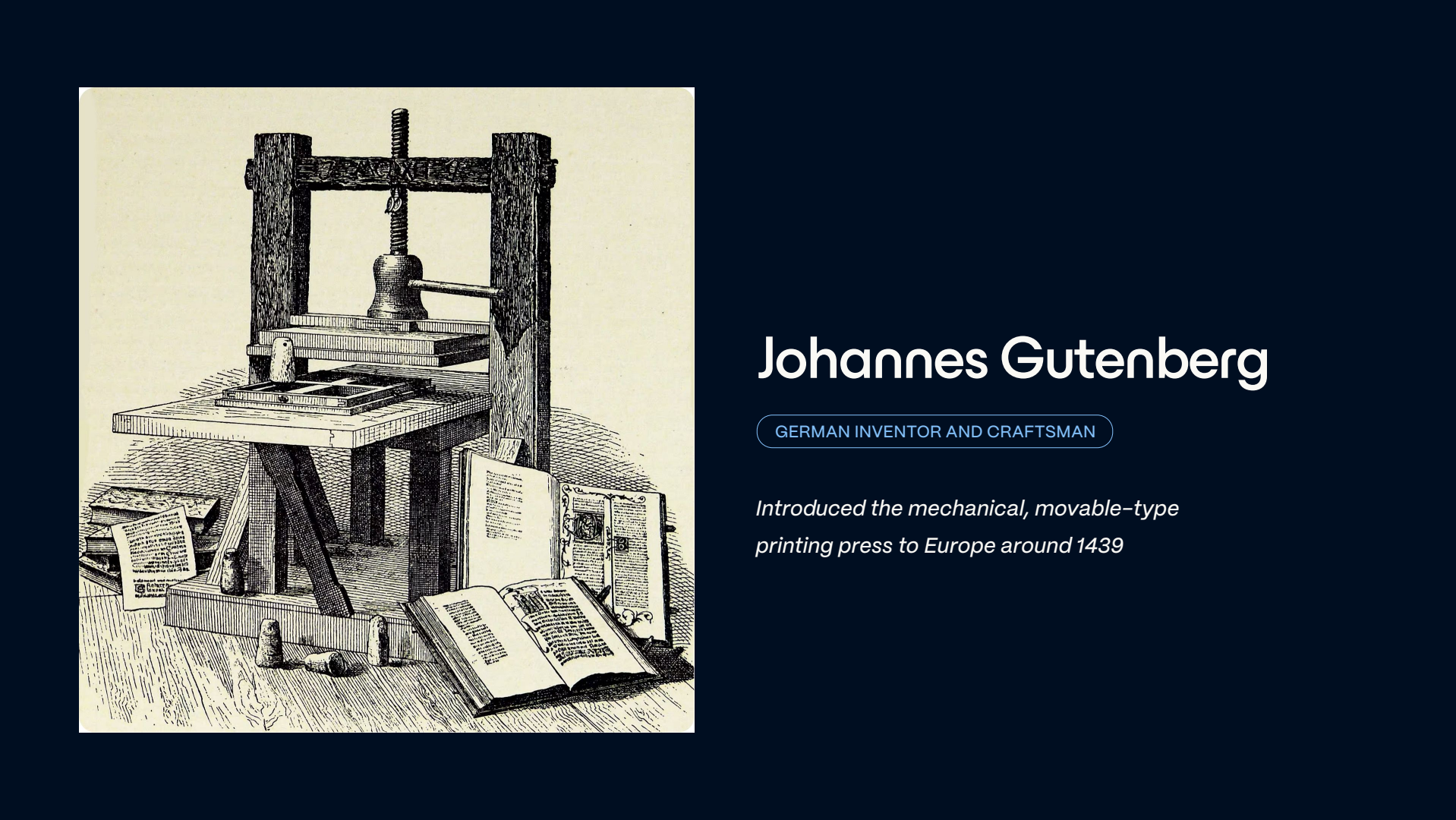
Printing and wider distribution attacked that in turn. Books became dramatically cheaper, literacy soared, and ideas started colliding in ways they never had before. The talk traced the consequences across three centuries: the Renaissance and Leonardo da Vinci, the Scientific Revolution, the telescope, the microscope, Newton's laws of motion.
Today everything is digital and ideas move further and faster than at any point in history. Proximity is solved. Access is solved. What remains is time.
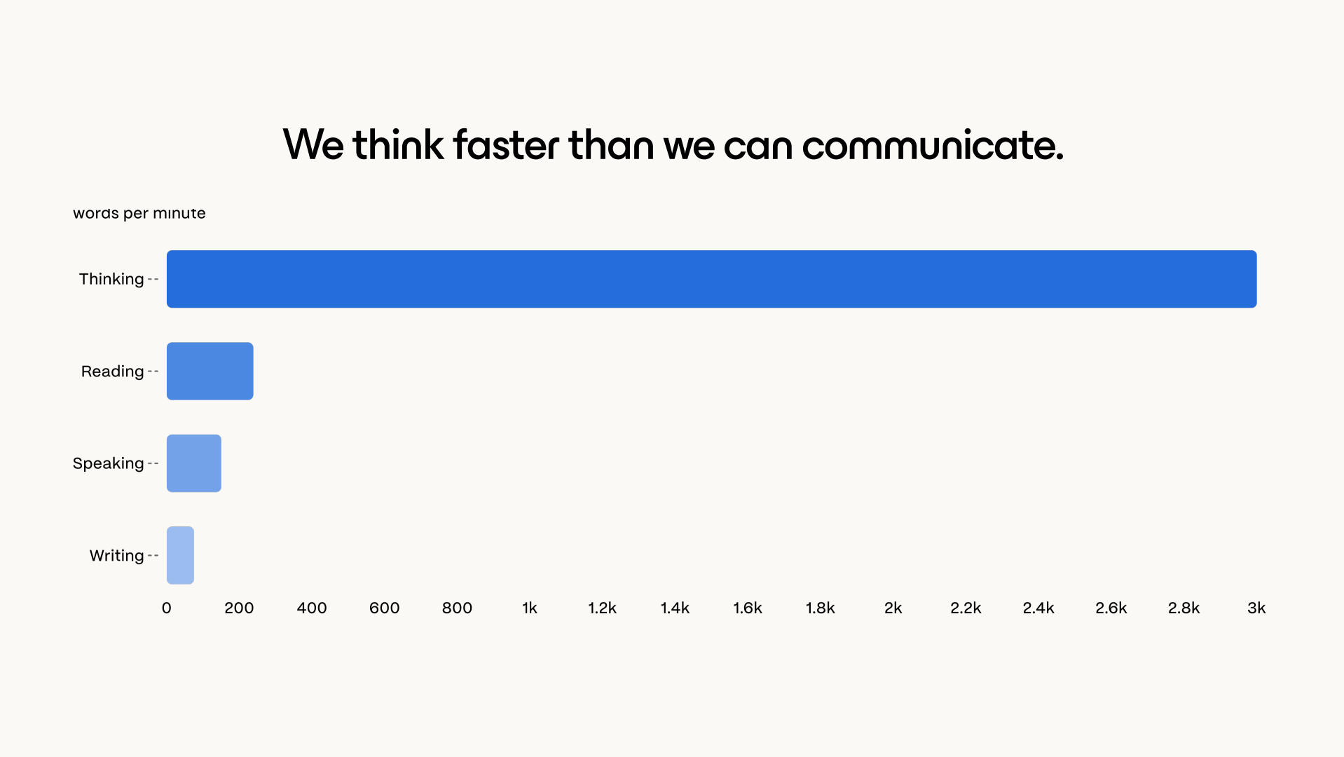
Here the keynote reached its sharpest observation. We think at roughly 3,000 words per minute, but most people read at only 200–300. The act of transferring a thought out of one head and into another is therefore slow, lossy and effortful by design — a bandwidth mismatch we have simply learned to live with.
Artificial intelligence appears, at first glance, to fix this. Producing words is now almost free: a half-baked idea becomes a polished three-page document in seconds. The speaker's counter-argument was blunt. AI has not solved the constraint, because the constraint was never your time — it was your audience's time. Readers still read at 200–300 words per minute and still decide within the first few sentences whether to continue.
Nor does summarisation rescue us. A reader can outsource reading — hand your three pages to a model and ask for the gist — but nobody can outsource understanding. Understanding still happens inside a human brain, at human speed, using a fixed supply of human attention. Meanwhile the volume of communication rises relentlessly.
The risk named on stage was that we are training people to skim, and then to skip ideas altogether — at which point the good ideas disappear alongside the bad ones.
“If I were to save an hour of time on writing, the worst possible thing I could do is create ten times more material for everybody else to read.”
The talk endorsed a recently published AI writing policy from Clay as “the right instinct”: authors should spend much more time writing a document than readers spend consuming it. The practical implication:
If time is the constraint, storytelling is the compression algorithm. The talk positioned storytelling as a critical part of human evolutionary history — “how we've been able to compress ideas, to make them shareable and digestible for others” — and insisted that its purpose is entirely audience-facing. A story exists to make a new idea easy to understand, easy to remember and easy to repeat. Length is not the measure; a bite-sized story can achieve all three.
The argument then turned to direction of travel: modern storytelling must evolve beyond campfires and books, and that evolution is fundamentally visual. Slides, documents, diagrams, charts and videos were invented to close the gap between how quickly an idea can be conceived and how quickly another person can absorb it.
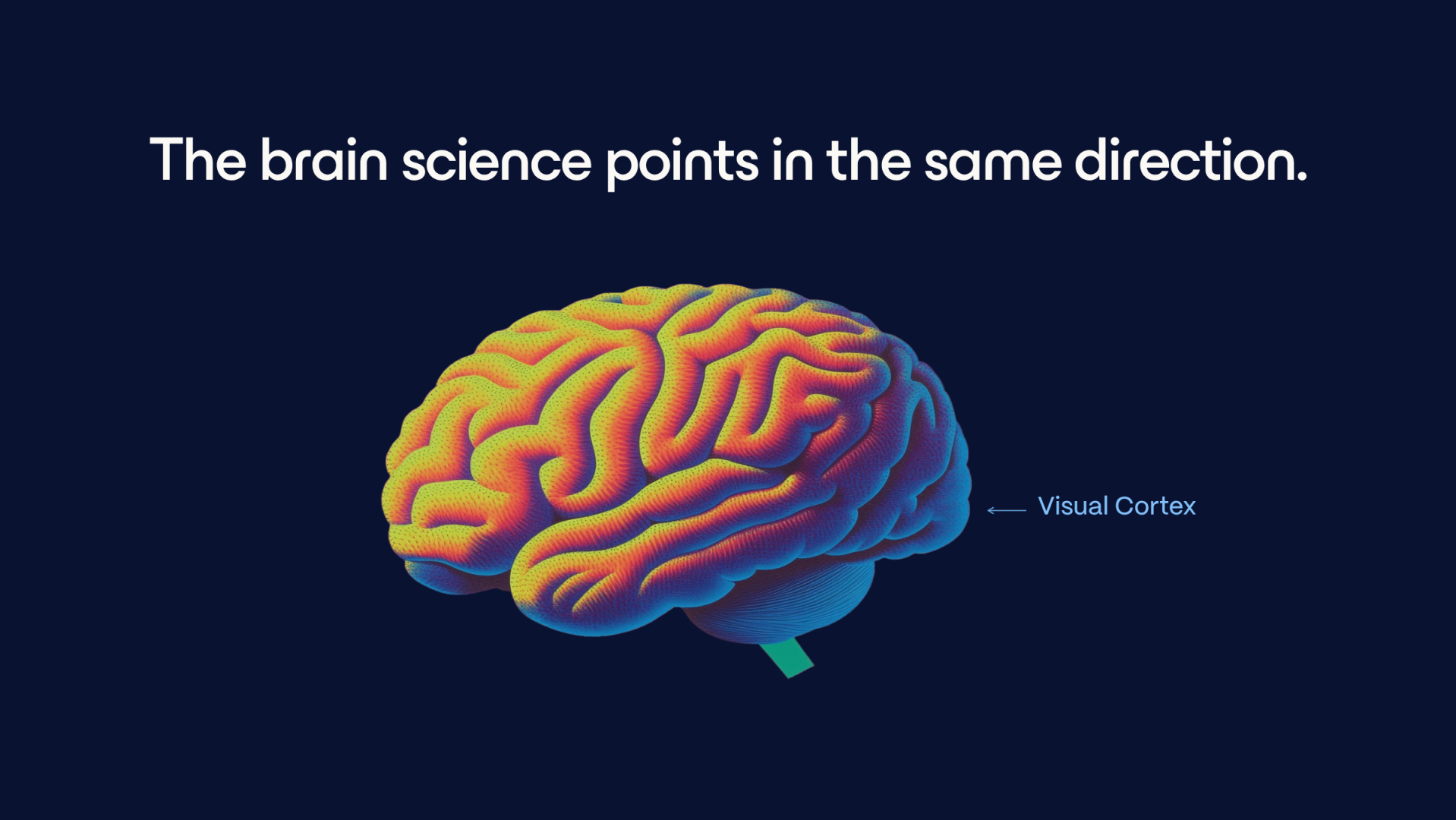
The intellectual anchor was Rudolf Arnheim, author of Visual Thinking, whose position was unfashionable in his day. Conventional wisdom treated perception as the front end of cognition — the eyes gather raw material and the real thinking happens elsewhere. Arnheim disagreed: recognising a shape, seeing a relationship, seeing a pattern is reasoning. As the keynote put it, “that's not just the input of thought, it is actually the thought forming.”
Three worked examples showed the same information reshaped rather than changed:
The audience then tested the claim directly. Everyone closed their eyes and imagined the speaker slowly raising his right hand — the left was holding the clicker — and performing a “raise the roof” motion. On opening their eyes, they watched the same action performed for real. The brain, the speaker noted, could not tell the difference: the same region fired either way.
Everyday language carries the same fingerprint. I see what you mean. I can totally picture that. What is your perspective? These are not accidents of idiom but evidence of how closely seeing and thinking are intertwined.

Presentations, the speaker argued, are uniquely well suited to carrying a visual language because they sit between a discussion and a document. They can be walked through by a group or reviewed alone, and moved backwards and forwards in ways other formats do not permit. Crucially, the author retains control over how much information lands at once, so the idea arrives in roughly the shape it was intended to arrive in.
A good presentation was described as “a shared window into reality”. Studies cited on stage found that when a group is presenting and everyone is looking at the same screen, debate and critique are far more likely to target the idea than the person — which turns a meeting into a discussion rather than an exercise in shooting the messenger. That is also why presentations became the de facto language of business: selling, strategy, planning and educating all depend on breaking a complex idea into a sequence that a group can examine together.
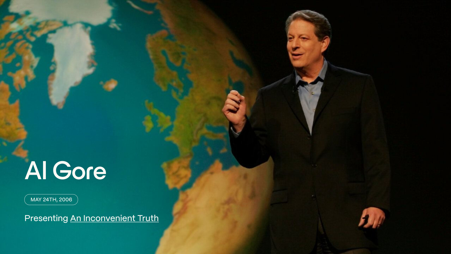
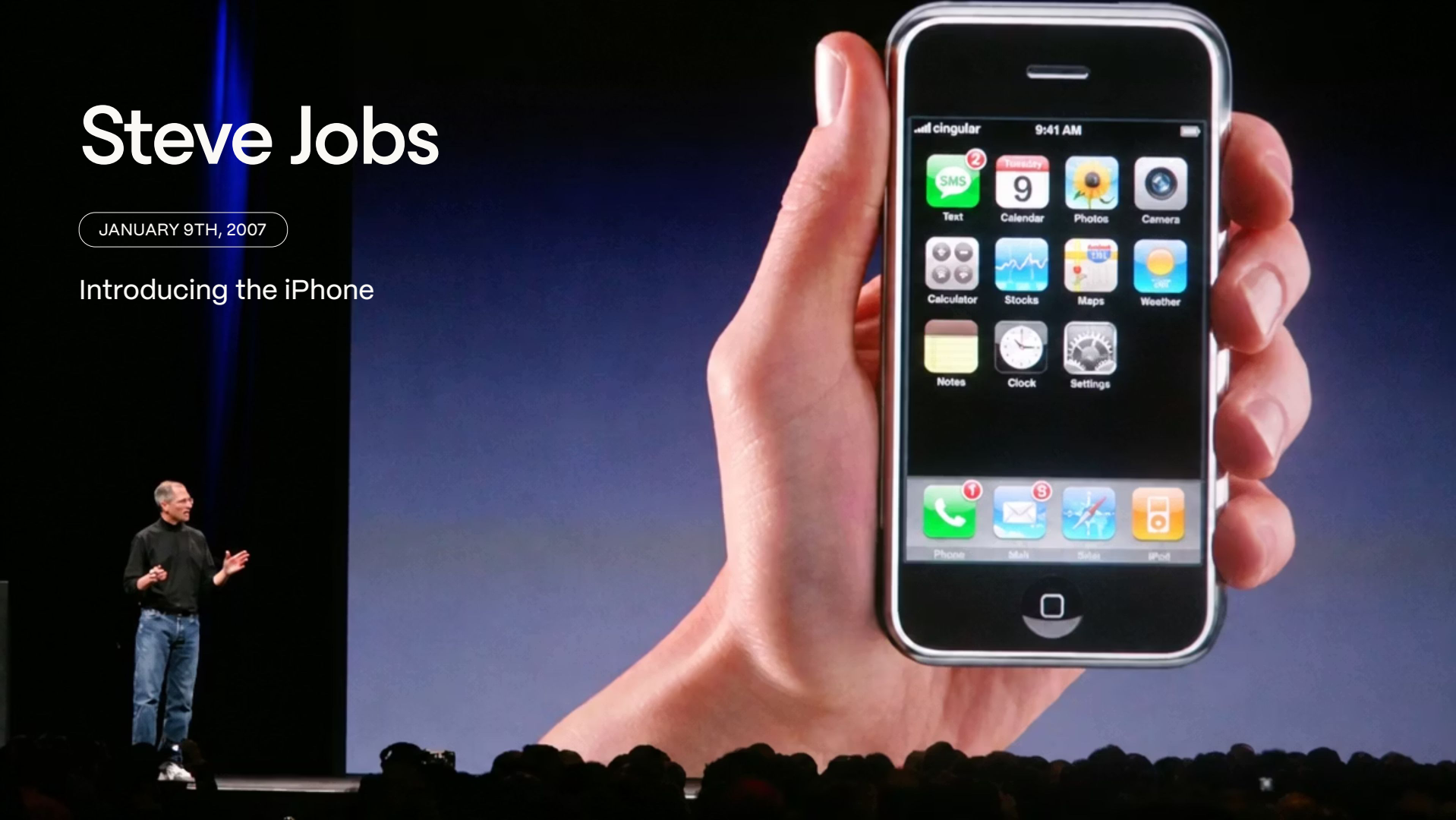
Three exemplars were offered of presentations that genuinely moved people:
What links them is not talent but labour. Each spent hundreds of hours preparing and sweating the visual detail, because they wanted their audiences to understand, remember and repeat the idea. In other words, they designed for the audience rather than for themselves.
The counter-example was the Space Shuttle Columbia in 2003. At launch, insulating foam broke away and struck the orbiter's left wing. After fifteen days in orbit, engineers at NASA and Boeing had to answer one question: could Columbia survive re-entry?
The prediction software they relied on had only ever been tested against debris the size of a golf ball. The piece of foam that hit the wing was the size of a briefcase — engineers estimated roughly 640 times larger than anything the model had been validated against. The software was being asked a question it could not answer.
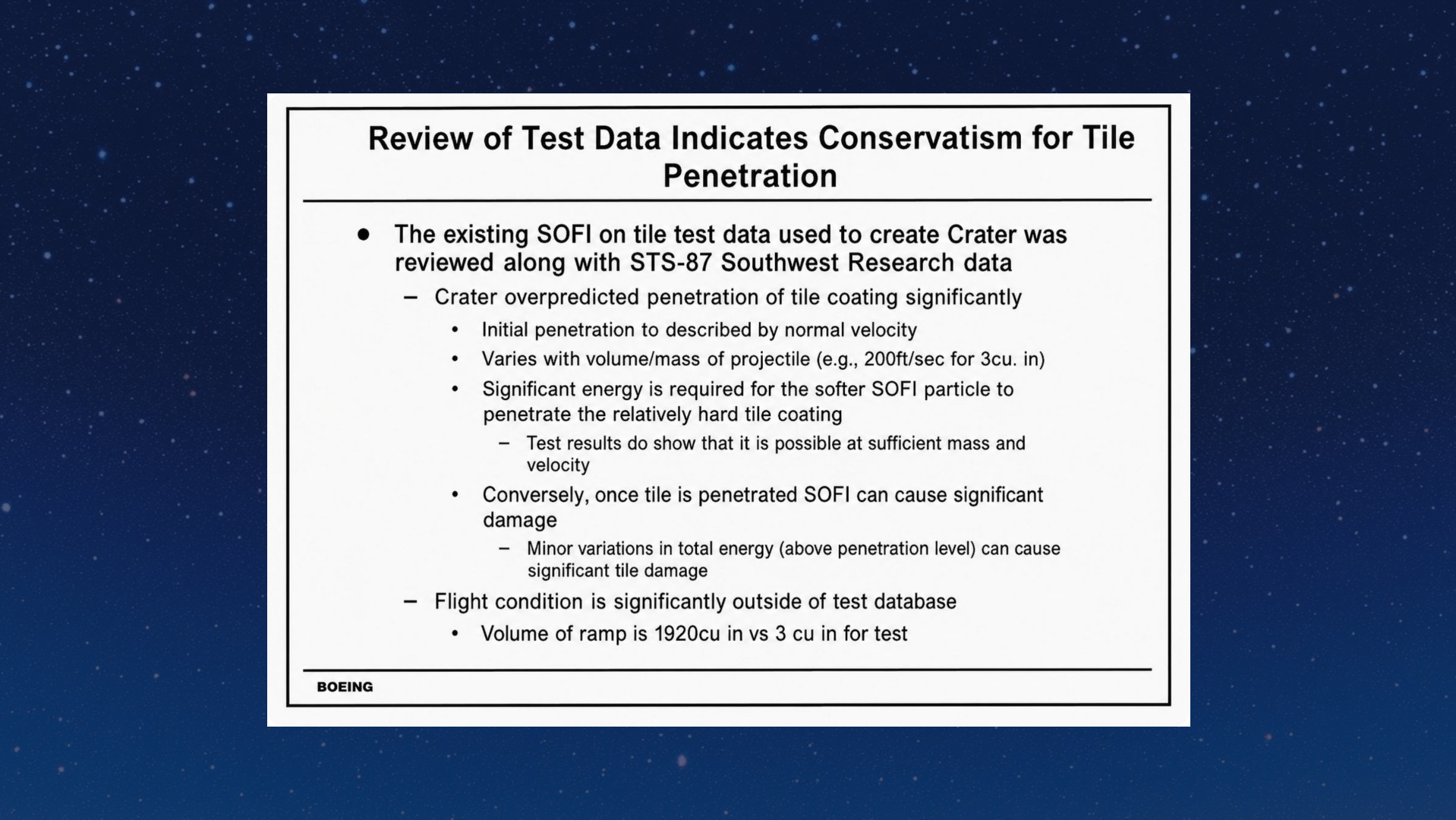
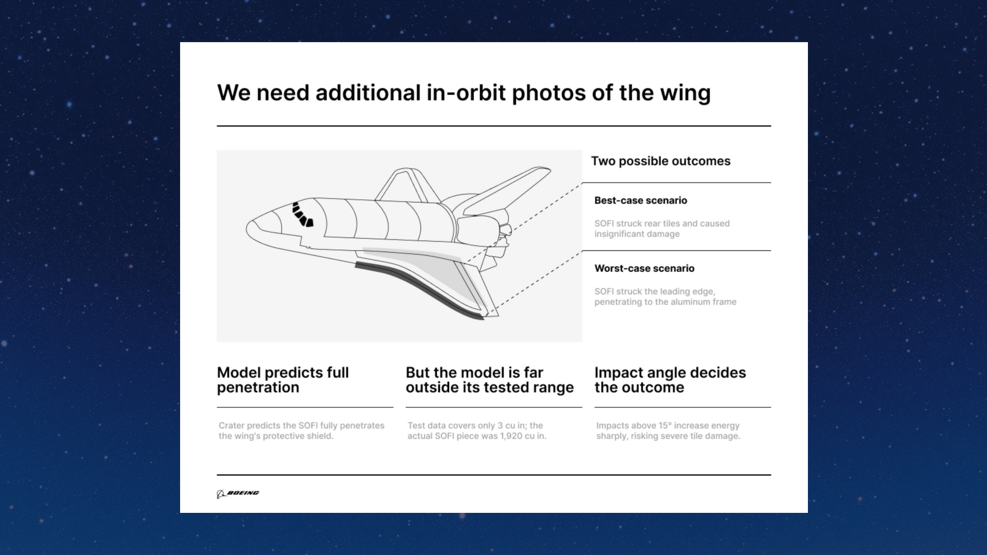
That decisive fact sat at the very bottom of the analysis slide, in the smallest text on the page. The headline at the top read “test data indicates conservatism” — implying the software over-predicted damage, and reading to a hurried eye as reassurance that the wing was probably fine. As the analysis travelled from engineers to managers to senior leaders, understanding degraded at every hop. The analysis was fundamentally misunderstood, so what was remembered and repeated was wrong. Columbia and her seven crew members never returned.
The author Bruce Gabriel later rebuilt the slide for understanding rather than completeness. His title states the decision required: more photos of the wing were needed. The body sets out the best case — only slight damage — and the worst case: debris punctured through the aluminium frame of the wing and re-entry would be extremely dangerous. Internal shuttle photographs were insufficient; satellite imagery from outside was required to inspect the true damage.
“The cost of bad communication is not an ugly slide. In this case, it was the wrong decision.”
The lesson drawn was deliberately uncomfortable for analytical teams: the quality of an analysis and the quality of its communication are two separate things. Gamma's stated mission follows directly from this — that society should not lose its craft for storytelling, and that good ideas should not be lost in transit. The test for any audience is simply whether they will understand, remember and repeat what you told them.
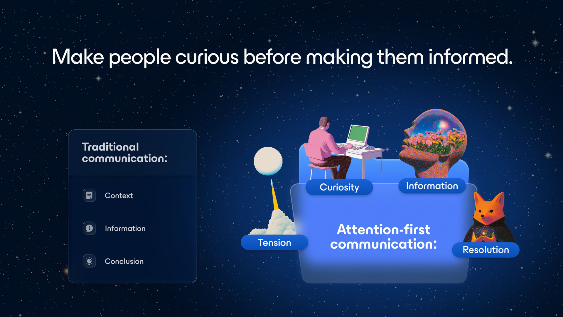
Storytelling, the speaker insisted, is a learnable craft — and three principles were offered as enough to put a presenter ahead of ninety-nine per cent of their peers. The first is sequencing: resist diving straight into detail, create tension, raise the stakes, and make your audience curious before you try to make them informed.
The case study came from Gamma Rama, a storytelling event Gamma hosted in New York City with some of the world's best storytellers. The Abdallah brothers — two Brazilian filmmakers who had never made a feature film — gave what was described as a masterclass in tension. Their ambition was to emulate Christopher Nolan and release an IMAX film. The catalyst was meeting the racing driver Felipe Nasr, who told them he would win Le Mans “or die trying”; they decided to shoot a documentary from the driver's perspective. They went on to become the youngest directors, and the first Brazilian directors, to release an IMAX film.
Their talk did not open with the outcome. It opened with four impossible things they needed within thirty days:
The audience leaned in, wanting to know how on earth it could be pulled off. That is what a well-sequenced introduction buys you.
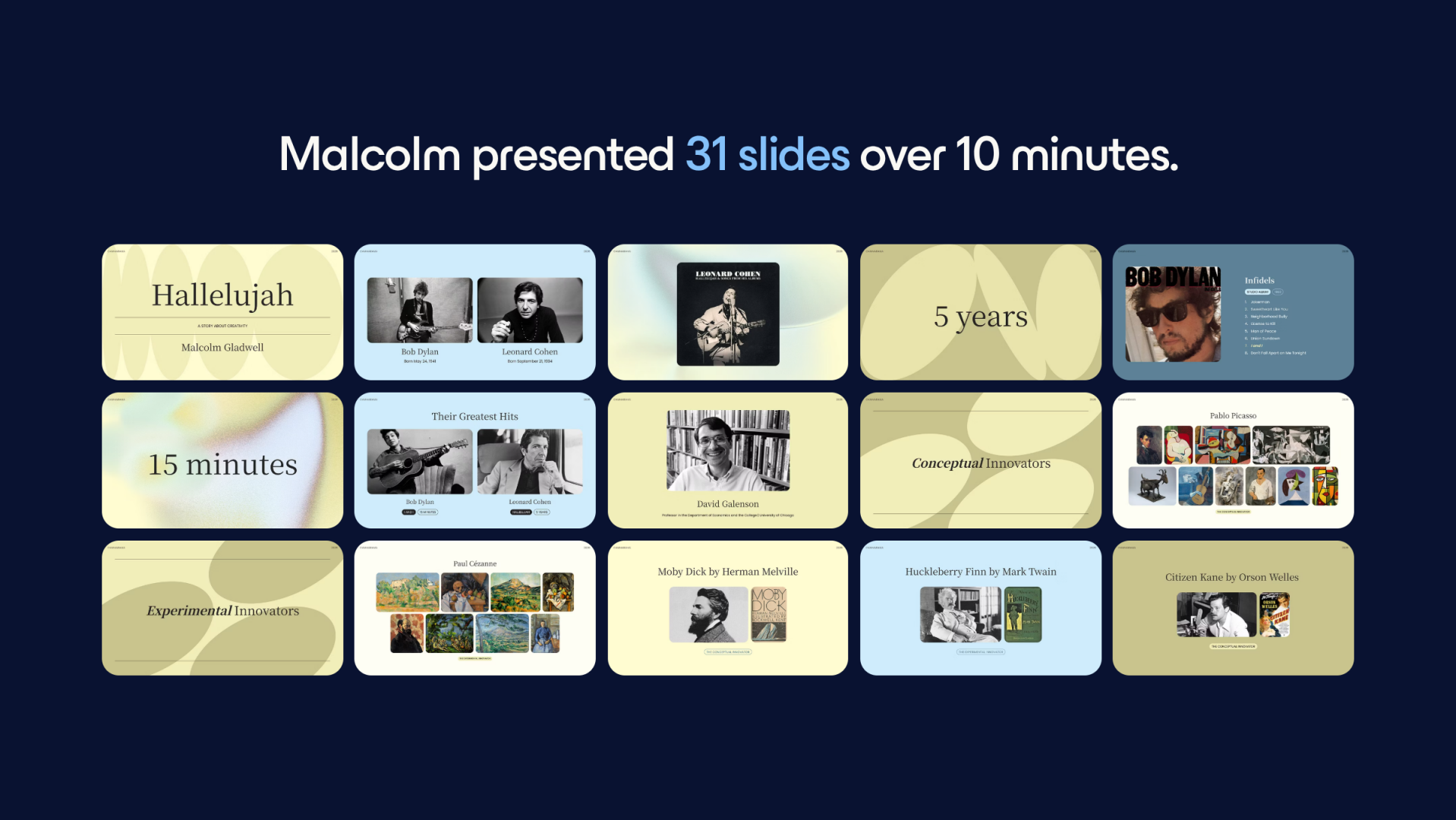
The familiar rule of one slide per minute was dismissed as far too restrictive. Storytellers usually need many more slides to build and hold tension. Malcolm Gladwell used 31 slides for a ten-minute talk arguing that creativity has two paths and that we overvalue the one that feels clear, fast and inevitable: conceptual innovators such as Picasso and Bob Dylan break through early and appear to receive ideas fully formed, while experimental innovators such as Mark Twain and Leonard Cohen produce volumes of work, test, iterate, absorb outside input and break through much later — Cohen's Hallelujah, among the most covered songs in modern music, being the defining example. Compressed into ten slides, the argument would not have landed.
Mike Birbiglia used 46 slides for a ten-minute story about trying to join his seventh-grade class's unofficial make-out club: the crush on Lisa Bazzetti after discovering he could make her laugh, the agreement to go to the carnival, the imagined romantic-comedy montage, a great deal of carnival food, the Scrambler, the vomiting, and the kiss that never happened. The visuals carried the audience through every beat. The refrain repeated on stage: “His story deserved more slides, not fewer.”
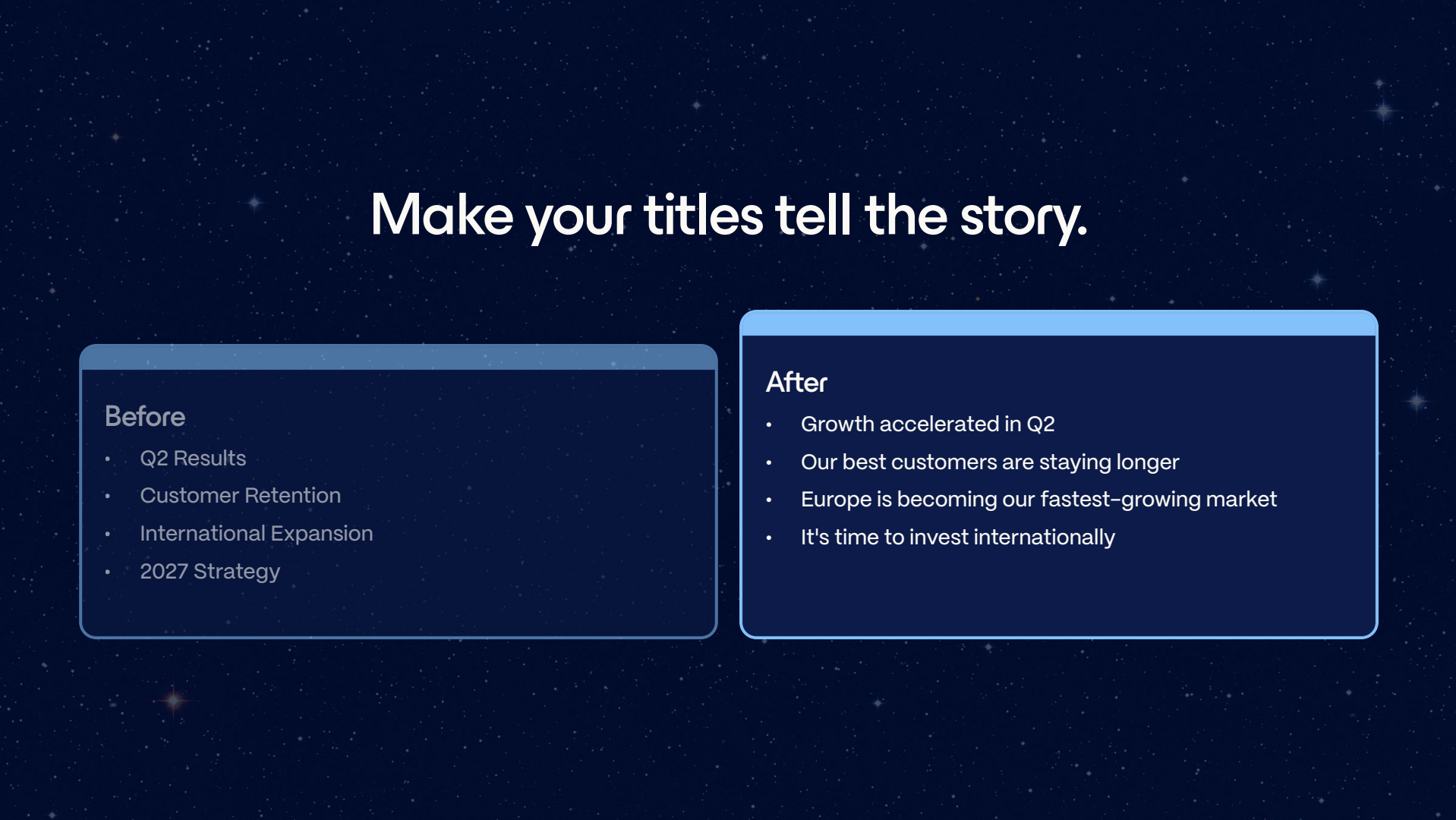
A reader should be able to get roughly 80% of the gist from the slide titles alone. That means replacing labels with assertions:
Titles written this way tell the audience exactly where they are being taken, and turn the deck into a road map rather than a filing system.

The second principle is about priming. Before an audience can absorb your detail, their brain has to be ready to take the journey with you — which usually means revealing the answer earlier than feels natural and resisting the instinct to front-load context.
The keynote borrowed a twentieth-century American newsroom maxim: don't bury the lede. Editors reminded reporters to put the most important information at the very top, and the rule transfers intact to presentations. If the audience only takes one thing away, make sure it was delivered up front rather than discovered on slide 24.
Alongside that sits the deliberate use of information gaps — curiosity gaps. Rather than stating a bare fact, lure the audience in. “Revenue increased by 32%” closes the loop immediately; “something unexpected happened after we changed pricing” opens one.
“The question should never be: how do I make the slide look better? The question should be: how do I help my audience understand, remember and repeat my ideas?”
Aesthetics, in other words, are not the objective. Attention is. Design serves the audience's comprehension, not the presenter's taste.
The third principle inverts the usual instinct to be comprehensive. The guiding question becomes: what is the smallest amount of information I can include that still delivers the point I am trying to make? The metaphor offered was an egg. Throw one and your audience can catch it; throw five and they drop all of them.
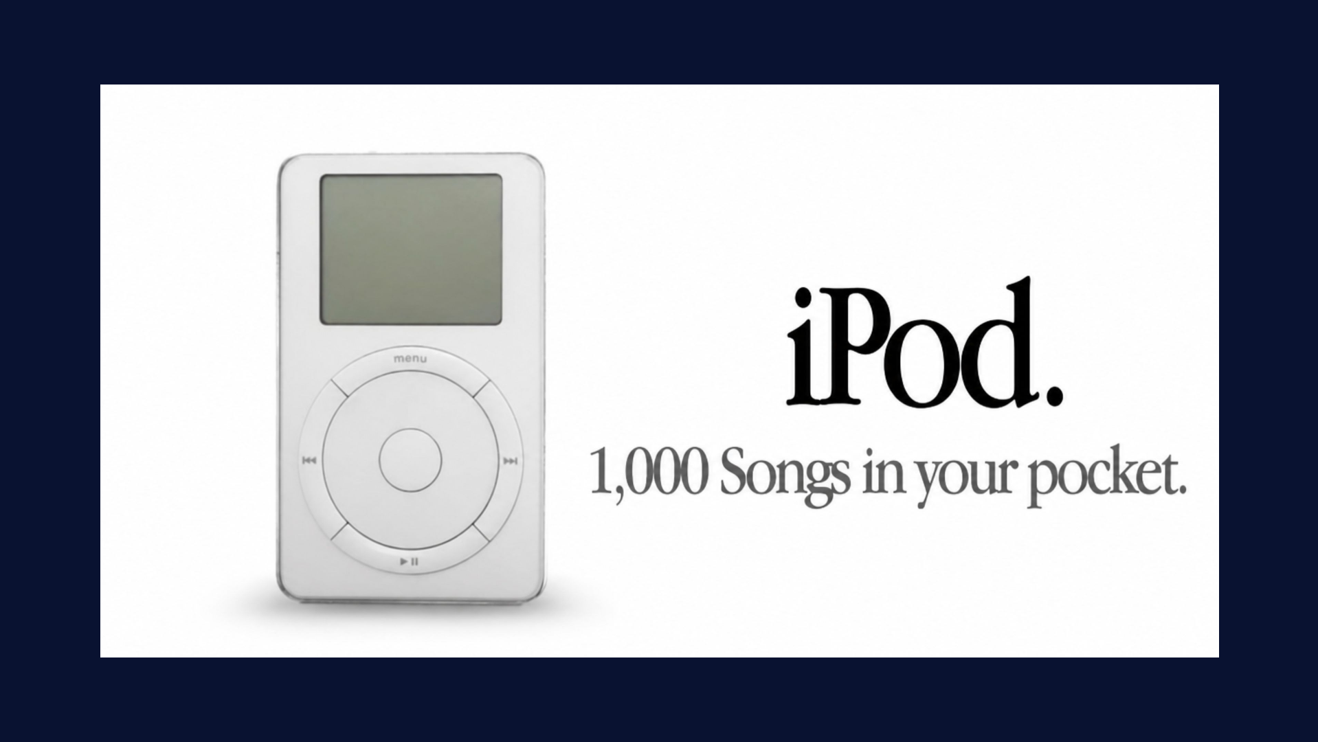
Consumer advertising was held up as the discipline that already understands this. Rather than listing features and specifications, Steve Jobs compressed an entire product into “1,000 songs in your pocket” — a visual metaphor that makes the destination immediately graspable. The talk also urged aggressive use of contrast, because contrast is inherently shareable: before versus after, old versus new, us versus them. And it argued for specifics over completeness — rather than listing every reason to adopt a pet, the SPCA tells the story of Julius the terrier.

Recapping, the three principles are:
The closing principle was the most personal. You are the presentation. If you do not want your work to look, sound or smell like AI, put in the effort to make the ideas your own. The permission granted from stage was explicit: it is fine to be weird, to be uniquely yourself, to be original. Kevin Kelly's line was invoked — “don't try to be the best, be the only” — alongside a blunter instruction: don't be boring.
This connects back to the anxiety that runs underneath the whole keynote. Gamma described itself as “pretty terrified” that society is losing the craft of storytelling: we create ever more content without asking whether any of it is easier for other people to consume, while the tools for genuinely visual communication remain hard to work with. The concern is not that AI writes badly, but that it may quietly strip out something deeply human.
“The people that believe their ideas matter are the ones that make their ideas matter.”
That belief, the speaker argued, is what drives you to write a second draft, to be intentional about every slide, and to spend three hours preparing a ten-minute talk — because the audience's ten minutes are worth protecting. The final framing closed the loop opened at the beginning: good communication leads to better decisions, and better decisions lead to better outcomes.